

Start at the Waiting Room: Reading One Doctor Booking Backwards Before You Trust It

Most booking pages are designed to be read forwards: search, pick a doctor, pick a time, confirm, done. That is also the worst order in which to judge one, because by the time you reach the confirmation screen you have already decided, and the page knows it. Everything after the search box is downhill. The useful way to read a doctor booking is backwards. Start where the consequences land — the waiting room, on the day, with a token number in your hand — and walk back through every promise the page made to get you there. Each step backwards is a chance to catch something before it costs you a morning.
The example in this post is the DocBook Pro demo, a doctor directory and appointment booking site built on a script called DocBook Pro. The script is listed on Codester at $29, built on Laravel 13, with four panels — super admin, clinic, doctor and patient — and a live demo that anyone can browse. I am going to read that demo the way a patient should: backwards, from the waiting room to the search box, and I am going to be blunt about what holds up and what does not. If you run a clinic, there is a short coda for you at the end. But first, the patient's side, in the order that matters.
First, the waiting room: what token number 14 actually promises
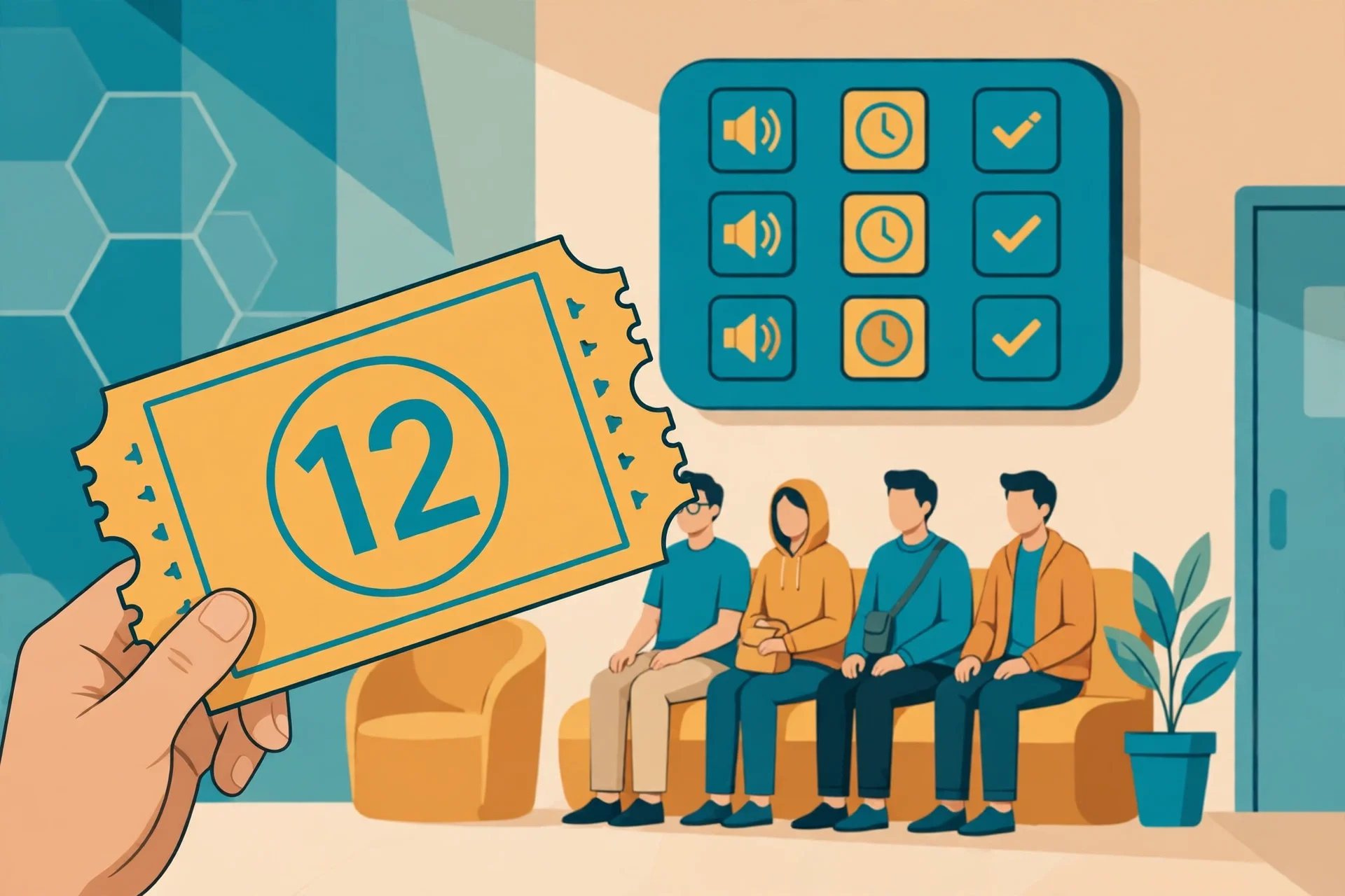
The demo's headline promise is a booking "in 60 seconds" ending with a "guaranteed token number". Its worked example is token number 14, for an appointment tomorrow at 4:30 PM, and its visit-day example is a live update: your token is now number 12, and you are up in about 20 minutes. Read backwards, the token is the whole product. It is the one thing a phone call cannot give you cleanly. A receptionist can tell you to come at 4:30, but they cannot tell you, at 4:08, that you are two numbers away. A token system can, provided the clinic actually advances it.
That proviso is doing more work than the demo admits. A token number is only as honest as the queue behind it. If the doctor is running an hour late and nobody advances the tokens, number 14 still says 14 while the waiting room fills up. If walk-in patients are slotted in ahead of booked tokens without the system knowing, the number becomes decoration. The demo shows the happy path — a token that moves, a message that arrives, a wait of about 20 minutes — and the happy path is genuinely good design. Live token updates on the day are the difference between sitting in a waiting room for two hours and arriving when your number is near, and the demo's own patient stories make exactly that point, including a parent who timed arrival around a toddler. I believe that use case completely. It is the most believable thing on the page, because it solves a pain anyone who has waited in a clinic knows by heart.
But notice what the token does not promise. It does not promise that the doctor will see you at 4:30. It promises that you are fourteenth in a sequence, and that the sequence is being tracked. Those are different promises, and a patient who confuses them will still be angry at 5:15, reasonably. My rule, reading backwards, is simple: trust the token as a queue position, not as a clock time. Arrive by the token updates, not by the appointment time alone. And if a real clinic using this system never sends you a live update on the day, treat that as information about the clinic, not about the software. The software can only report a queue that someone is actually advancing.
There is a second, quieter promise inside the token: that you booked as a guest or logged in, with an OTP in the guest case, according to the Codester listing. Guest booking matters more than it sounds. A patient in pain, booking at 11 PM — the demo's own story has a dermatologist booked at 11 PM and seen the next morning — does not want to create an account, verify an email, and set a password before they can hold a slot. Guest booking with OTP removes that wall while still tying the booking to a real phone number. I did not complete a booking in this run, so I cannot confirm the OTP arrives promptly or that the guest flow is as short as the listing claims. That is a gap I will not paper over. But as a design choice, guest booking is the right one, and it is the choice I would check first on any real clinic site built this way: can a stranger hold a slot in under a minute without an account? If the answer is no, the 60-second headline is already broken.
Next, the reminder: the message you will actually read
Step one backwards from the waiting room is the reminder, and here the demo is specific in a way I like. WhatsApp reminders go out 24 hours and 2 hours before the visit, plus live token updates on the day. The listing behind the demo adds email and SMS reminders with delivery logs, and WhatsApp via the Meta Cloud API with a Twilio fallback. Specificity is a trust signal. A page that says "we remind you" is making a wish. A page that says "24 hours and 2 hours, on WhatsApp, with delivery logs" is making a claim you can test: book, wait, and see whether two messages arrive.
There is a reason the channel matters. Appointment reminders sent by email are reminders in the same sense that a letter is a conversation: technically true, practically ignored. Most people do not live in their email inbox. They live in WhatsApp. A reminder that arrives where the patient already is, twice, at two useful distances from the visit, is worth more than a reminder system with five channels nobody checks. The 24-hour message lets you rearrange your day. The 2-hour message catches the appointment you forgot while rearranging it. The token update on the day does the third job, which is not reminding at all but steering: come now, not in an hour.
My reservation is about the fallback, not the promise. The listing says Twilio fallback for WhatsApp, and SMS via Twilio, Vonage or Msg91, all queued with retries. That is reassuring on paper, but a patient cannot see a delivery log, and a clinic that never checks its logs will never know its reminders are failing. If you are the patient, the test is embarrassingly simple: after your first booking on a real site, check whether both reminders arrive. If only one arrives, or neither, say so to the clinic. You are not complaining about software. You are reporting the one failure mode that quietly creates no-shows, which is the exact problem the reminders exist to solve. And if you are the clinic, the delivery log is not an admin curiosity. It is the difference between "patients do not show up" and "our reminders do not go out", and those two sentences demand completely different fixes.
Then the fee: the number the homepage promises and the cards do not show
Keep walking backwards and you reach the fee, and here the demo stumbles in an instructive way. The homepage promises that patients can "compare real fees and patient reviews". That is a strong promise, and it is the right promise: a patient choosing between doctors needs the fee before the visit, not at the desk afterwards. But on the featured doctor cards in the view I inspected, I could not see a fee figure at all. The cards show speciality, rating with its review count, years of experience, clinic name and city, and a verified badge. They do not, in that view, show a price.
That gap might be a demo presentation choice. The fee might appear on the doctor's full profile, or at the booking step, and I did not complete a booking to find out. I am not going to claim the fee is hidden everywhere on the basis of one homepage view. But the gap still matters, because the homepage makes the comparison promise at the exact place — the doctor card — where the patient is doing the comparing. A promise made in the headline and kept three clicks later is a promise half kept. Patients compare cards, not profiles. If the fee is not on the card, most patients will not compare fees at all. They will compare ratings, which are easier to see, and choose the highest-rated doctor they can afford without knowing whether they can afford them.
There is a second fee confusion on the same page, and it is one the demo itself creates. Scroll down and you find pricing: Starter at ₹19 a month, Growth at ₹49, Scale at ₹99, with a 14-day free trial and a "zero commission" claim. A patient skimming this page could easily read those as consultation prices. They are not. They are clinic subscription plans — what a clinic pays to run on the platform — and the "keep 100% of your consultation revenue" line confirms it. The demo is not trying to deceive anyone; the section is labelled for clinics. But a page that serves two audiences, patients and clinics, will always confuse the skimming reader of one audience with the prices of the other. My advice to patients is blunt: ignore every rupee figure in the clinic pricing section. Your fee is the per-doctor consultation fee, and if you cannot see it on the card or the profile before you confirm, ask the clinic before you book. A booking system that shows you everything except the price has shown you everything except the decision.
Then the rating: a number is not a verdict until you see its denominator

Backwards again, and you reach the rating, which is where most patients actually start — and where most patients get misled. The demo's featured cards are a small masterclass in how to read ratings, because they show the denominator. Dr. Aarav Sharma: 4.6, from 9 reviews. Dr. Rohan Mehta: 4.1, from 7. Dr. Priya Nair: 4.0, from 11. And then three doctors at 0.0, from zero reviews each: Dr. Sneha Kulkarni with 8 years of experience, Dr. Vikram Reddy with 9, Dr. Ananya Iyer with 10.
Read those numbers the way most people read them and you will conclude that the 4.6 doctor is the best and the 0.0 doctors are the worst. Read them properly and you conclude almost the opposite about what you know. A 4.6 from 9 reviews is a hint, not a measurement. Nine happy patients could be nine friends, nine easy cases, or nine genuinely delighted strangers; the card does not say, and nine is too few to distinguish those stories. A 4.0 from 11 reviews is, if anything, slightly more informative than a 4.6 from 9, because it rests on more people, even though the number is lower. And a 0.0 from zero reviews is not a bad rating. It is the absence of a rating, displayed honestly as a number, and it tells you nothing about the doctor except that nobody has reviewed them on this platform yet. The most experienced doctor on the featured list, Dr. Iyer at 10 years, is one of the 0.0 doctors. Experience and review count are different things, and the card lets you see both, which is to its credit.
The demo's own average, 4.2 out of 5 across the platform, deserves the same scepticism. An average across doctors with wildly different review counts is a marketing number, not a quality measure. It is pulled up by small, happy samples and dragged down by nobody, because the unrated doctors contribute nothing to it. I do not hold that against the demo specifically — every directory does this — but a patient should not choose a platform by its average rating, and should not choose a doctor by a single decimal. My rule: ignore any rating with fewer than about ten reviews as a ranking signal, treat it as a tiebreaker at most, and read the review text if the profile offers it. A single detailed review about waiting times, or about whether the doctor explains things, is worth more than a 4.6 built on nine silent stars.
There is one more honest beat on these cards that I want to credit, because it is easy to miss. Every featured doctor carries a "Verified" badge. Verified, on a directory, should mean that someone checked that this person is a real doctor at a real clinic — not merely that they created an account. The demo does not, in the view inspected, spell out what verification checks. That is a real omission, and on a medical directory it matters more than on any other kind of directory. A verified badge on a movie site is decoration. A verified badge on a doctor site is a safety claim. If you run a clinic on this system, spell out your verification process on the site itself, in one sentence, where the badge appears. If you are a patient, treat "Verified" as a question, not an answer: verified how, by whom, and when? Until the site answers that, the badge is a promise waiting for its proof.
Then the specialities: two labels on one doctor deserve a second look
Still walking backwards, you reach the speciality labels, and here the demo's cards raise a question worth pausing on. Dr. Sharma is listed under Neurology and Dentistry. Dr. Mehta under Cardiology and Pediatrics. Dr. Nair under Dermatology and Neurology. Dr. Kulkarni under Cardiology and Psychiatry. These are not neighbouring fields. A neurologist who also practises dentistry, or a cardiologist who also sees children, is possible — doctors do hold more than one qualification — but a card that pairs distant specialities without explanation invites the patient to assume the worst, which is that the labels are categories the doctor ticked rather than qualifications they hold.
I am not accusing the demo of inventing qualifications. Demo data is demo data, and these pairings may simply be illustrative filler chosen to show that a doctor can carry two labels. But the reading lesson survives the demo context, because real directories have the same problem. When a real doctor carries two distant specialities, check the full profile before booking: qualifications, degrees, and the clinic they practise at. The demo's cards do show clinic names and cities — CityCare in Mumbai, Lakeside in Delhi, Greenview in Bengaluru — and those are checkable facts. A doctor at a named multi-speciality clinic in a named city is a claim you can verify with a phone call or a search. A pair of speciality labels, on their own, is not. The profile is where the labels either earn their keep or fall apart, and the card is only the invitation to look.
That is also why the search filters matter more than they appear to. The demo promises filtering by speciality, city, fee and rating, and to see who is available today, tomorrow, or this week. Availability filtering is the most underrated feature on any booking site. A directory that shows you every doctor, including ones with no slots for a month, wastes the patient's scarcest resource, which is not money but the willingness to keep looking. A directory that shows you only who is available this week respects it. The demo's three-step flow puts availability in the second step, at booking, rather than the first, at search, and I would argue that is backwards even by the demo's own logic. If the whole point is a visit in 60 seconds, the search should only return doctors you can actually see soon. Everything else is a catalogue, not a booking tool.
Last, the search box: the step you should take most seriously and trust least
And so, backwards, we finally arrive where the page begins: the search box. "Cardiologist near me", speciality and city filters, a promise of verified doctors and instant confirmation. After everything above, the search box looks different. It is not the start of the decision. It is the funnel that narrows a large, noisy catalogue into a shortlist, and a funnel is only as good as what it filters on. Speciality and city are honest filters. Fee and rating are honest filters only if the fee is visible and the rating has a denominator, which, as we have seen, is not always true on the same page. Availability is the filter that decides whether the shortlist is real.
Here is my blunt opinion about search on doctor sites, after reading this demo backwards: the search box deserves the least trust on the page and the most attention from the patient. Trust it least because it shows you the platform's best face — verified badges, high averages, a 60-second promise — before any of the underlying facts have been checked. Give it the most attention because every filter you apply, or fail to apply, decides which doctors you never see. Search by speciality first, then by city, then by availability this week, and only then by rating — and when you sort by rating, remember the denominators. A 4.0 from 11 reviews beats a 4.6 from 9 in information, even if it loses in decoration.
If you use this site's own temporary inbox — for checking a service before trusting it with your real address — you already understand the habit this post is describing. It is the same habit behind the earlier posts in this series on reading a movie title page before downloading anything and reading a salary-first job listing before applying: check the page before you commit to what it offers. You would not hand a strange service your main email before you know what it does with it. A doctor booking deserves the same caution in reverse: check the waiting-room promise, the reminders, the fee, the rating's denominator, and the speciality labels before you hand a clinic your time, your money, and your health details. The booking takes 60 seconds. The reading should take five minutes. That is a good trade, and it is the only part of the visit you fully control.
The other side of the page, if you run a clinic
Everything above was the patient's side. The operator's side is shorter, and it starts with the price that is actually verified: DocBook Pro is listed on Codester at $29, built on Laravel 13, with four panels, 24 online payment gateways plus bank transfer and pay-at-clinic, reminders on email, SMS and WhatsApp with delivery logs, and a five-step installer. Those are the listing's own claims, and they describe a complete booking SaaS rather than a simple form. The demo's clinic plans — ₹19, ₹49 and ₹99 a month with a 14-day trial — are the demo's own subscription tiers, not the script's purchase price, and confusing the two would be exactly the fee confusion this post warns patients about.
What the demo shows, as a product, is a shape that works: a directory with real search filters, doctor profiles with live slot calendars, a token queue patients can follow, reminders on the channel patients actually read, and prescriptions, billing and telemedicine behind the panels. What it does not show is the labour that keeps that shape honest: verifying doctors and saying how, keeping fees on the cards where patients compare them, advancing the token queue on the day, and reading the reminder delivery logs when no-shows rise. A booking system buys you the shape. It does not buy you the checking, and on a medical directory the checking is the product, because a token that never moves and a verified badge nobody verified are broken promises at exactly the moment a patient is most vulnerable.
Who should not book this way
If you need urgent care, do not book this way at all. A directory, however good, is for planned visits: a dermatologist next week, a cardiology follow-up, a paediatric check. Chest pain, a serious injury, or a rapidly worsening symptom is not a booking problem. It is an emergency problem, and no token number solves it. Go to urgent care or call emergency services instead of comparing ratings.
More posts in this series, each reading one page the way a careful user should, live on the blog index. If you only need one trusted family doctor you already know, do not shop around on a directory either. Book directly with that doctor's clinic, by whatever route they prefer, and keep the directory for the day you move cities or need a specialist you have never seen. A directory is a tool for finding someone new. Using it to rediscover someone you already trust is wasted effort, and it risks replacing a known doctor with a better-rated stranger on the strength of nine reviews.
Frequently asked questions
What exactly is DocBook Pro?
A doctor directory and appointment booking script, listed on Codester at $29 and built on Laravel 13, with four panels for super admin, clinic, doctor and patient, appointment tokens, reminders, prescriptions, telemedicine, patient records and billing, and 24 online payment gateways plus bank transfer and pay-at-clinic, according to the listing's own description. Its live demo is at docbook-demo.tempomailusa.com.
Is the demo free to browse?
Yes, on the pages visited. Browsing the homepage, reading doctor cards, and seeing the clinic plans cost nothing, and no sign-in prompt or payment demand was seen on the homepage view inspected. The booking flow itself was not completed in this run, so nothing is claimed about confirmation or OTP behaviour after booking.
What does the token number actually guarantee?
A place in a queue, tracked live on the day, not a clock time. The demo's example is token 14 for 4:30 PM, with a visit-day update when the token reaches 12, about 20 minutes before being seen. Trust it as a queue position and arrive by the token updates; if the clinic never advances the queue, the number is information about the clinic, not the software.
Why do some doctors show 0.0?
Because they have zero reviews on the demo, not because patients rated them badly. A 0.0 from zero reviews is the absence of a rating, displayed as a number. The demo's 0.0 doctors include its most experienced featured doctor, at 10 years. Judge unrated doctors by their qualifications, clinic and availability, not by the zero.
Are the ₹19, ₹49 and ₹99 prices what patients pay?
No. Those are the demo's clinic subscription plans — Starter, Growth and Scale — with a 14-day free trial and a zero-commission claim for clinics. A patient's consultation fee is a separate, per-doctor figure, and no fee figure was visible on the featured doctor cards in the homepage view inspected. If you cannot see the fee before confirming, ask the clinic before you book.
Should I pick the highest-rated doctor?
Not on the rating alone. A 4.6 from 9 reviews carries less information than a 4.0 from 11, and a single detailed review about waiting times or explanations is worth more than a small-sample average. Filter by speciality, city and availability first, then use ratings — with their denominators visible — as a tiebreaker.
Need a disposable temporary email?
Protect your real inbox from spam and promotional clutter instantly and free.
Received a suspicious email, text, or charge alert?
Verify whether the sender domain is disposable, spoofed, or unverified before clicking links.